إنستجرام يغير شكل اسمه لأول مرة منذ 10 سنوات.. والإنترنت يلوم جيل Z

16 أغسطس 2026·اليوم السابع
إنستجرام يغير شكل اسمه لأول مرة منذ 10 سنوات.. والإنترنت يلوم جيل Z

أجرى تطبيق Instagram تغييرًا جديدًا في هويته البصرية، بعد نحو 10 سنوات من الاعتماد على تصميم كلمة "Instagram" بخط متصل، إذ كشفت المنصة المملوكة لشركة Meta عن Wordmark جديد أكثر بساطة وحداثة.

ووصف الرئيس التنفيذي لإنستجرام آدم موسيري التصميم الجديد بأنه أكثر عصرية، موضحًا أن الشكل السابق أصبح يبدو قديمًا بعد مرور نحو عقد على تقديمه، ويظهر الـWordmark الجديد، الذي يتكون من اسم Instagram فقط، في عدد من أماكن واجهة التطبيق، من بينها الجزء العلوي من تطبيق إنستجرام.

إنستجرام يستبدل الخط المتصل بتصميم أبسط

يستبدل التصميم الجديد الخط المتصل الذي ظهر في هوية Instagram منذ عام 2016 بخط أبسط وأكثر حداثة، وقال موسيري عبر منصة Threads إن الشركة قامت بتحديث الـWordmark لأنه ظل دون تغيير لأكثر من عقد وأصبح يبدو قديمًا، ويأتي التغيير ضمن محاولات Instagram تحديث هويته البصرية، دون تغيير جذري في الشعار المصور الشهير المستخدم لرمز التطبيق.
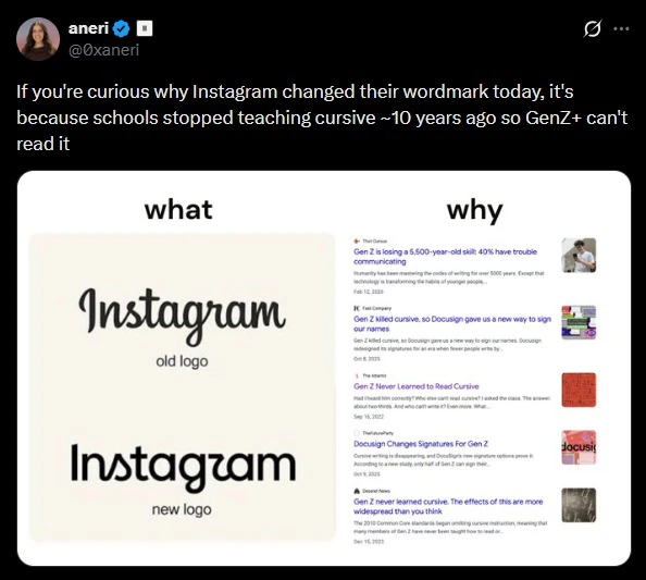
image_2026-08-14_142527812  

لماذا يلوم البعض جيل Z؟

بمجرد الكشف عن التصميم الجديد، بدأ بعض المستخدمين على منصة X في ربط التغيير بجيل Gen Z، بدعوى أن أفراد هذا الجيل لم يعودوا قادرين على قراءة الكتابة بالخط المتصل "Cursive"، وقال أحد المستخدمين، في تعليق ساخر، إن السبب في تغيير Instagram لشعاره هو أن المدارس توقفت عن تعليم الكتابة المتصلة قبل نحو 10 سنوات، وبالتالي أصبح أفراد جيل Z غير قادرين على قراءتها، وبدأ آخرون في التعامل مع التغيير باعتباره انعكاسًا لانقسام جيلي بين من اعتادوا على الخط المتصل ومن لم يعتادوا عليه.
وتعتمد هذه الفكرة على اختلاف طرق تعليم الكتابة بين الدول، قفي الولايات المتحدة، لم تتضمن معايير Common Core التي أُقرت عام 2010 الكتابة بالخط المتصل باعتبارها مهارة إلزامية، في حين ركزت على مهارات الكتابة باستخدام لوحة المفاتيح، كما أشار التقرير إلى استطلاع أجرته DocuSign وجد أن نحو 51% من أفراد جيل Z في الولايات المتحدة يستطيعون توقيع أسمائهم بالخط المتصل، مقارنة بنحو 80% من جيل طفرة المواليد Baby Boomers.
ومع ذلك، بدأت ولايات أمريكية عدة خلال السنوات الأخيرة في إعادة فرض تعليم الكتابة بالخط المتصل في المدارس، ما يعني أن الصورة ليست موحدة في جميع أنحاء الولايات المتحدة.

مستخدمون: الخط المتصل أصبح "أثرًا ثقافيًا"

اتفق بعض المستخدمين مع فكرة أن تراجع استخدام الخط المتصل بين الأجيال الأصغر أصبح واضحًا، وقال أحدهم إن الخط المتصل أصبح في الوقت الحالي أقرب إلى "أثر ثقافي"، بعدما كان في الماضي جزءًا أساسيًا من مهارات الكتابة، ويرى مؤيدو هذا الرأي أن الشكل الجديد لاسم Instagram قد يكون أكثر سهولة في القراءة بالنسبة إلى المستخدمين الأصغر سنًا الذين لم يعتادوا على الكتابة بالخط المتصل، فيما لم يكن الجميع معجبًا بالتصميم الجديد، لكن الاعتراض هذه المرة لم يكن مرتبطًا بجيل Z.
فقد أشار بعض المستخدمين إلى أن شكل الحروف الجديدة قد يسبب التباسًا في قراءة الاسم، خصوصًا أن تصميم بعض الحروف يجعل حرف "r" يبدو شبيهًا بـ"z"، ودفع ذلك بعض المستخدمين إلى السخرية من التصميم والقول إن اسم التطبيق أصبح يبدو وكأنه "Instagzam" بدلًا من Instagram، ووصف أحد التعليقات الشكل الجديد بأنه يمكن أن يبدو وكأنه اسم علامة تجارية جديدة في مجال مستحضرات العناية بالبشرة.

آخر تغيير كبير في هوية Instagram

لم يكن هذا أول تغيير تجريه Instagram على هويتها البصرية، ففي المرة السابقة التي أعادت فيها المنصة تصميم شعارها، تخلت عن أيقونة الكاميرا ثلاثية الأبعاد التقليدية، وانتقلت إلى التصميم الملون ذي التدرجات اللونية الشفافة الذي لا يزال مستخدمًا حتى الآن، أما التغيير الحالي، فيركز بصورة أساسية على الـWordmark المكتوب، وليس على رمز التطبيق نفسه، زرغم أن تغيير شكل كلمة Instagram قد يبدو تعديلًا بسيطًا، فإنه أثار نقاشًا واسعًا على الإنترنت حول تغير الذوق البصري بين الأجيال، واختفاء الخط المتصل من الاستخدام اليومي، ومدى تأثير عادات القراءة والكتابة الجديدة على تصميم العلامات التجارية، وبينما ترى Instagram أن التصميم الجديد أكثر حداثة، يرى بعض المستخدمين أنه أقل وضوحًا من النسخة السابقة، فيما حول آخرون التغيير إلى مادة للسخرية وربطوه بجيل Z.


InstagramMetadesign
الخبر متوفّر باللغات التالية:English
المصدر الأصلي للخبر
اليوم السابع

Instagram changes its name for the first time in a decade...and the internet blames Generation Z

August 16, 2026·Youm7
Instagram changes its name for the first time in a decade...and the internet blames Generation Z

Instagram has made a new visual identity change, after nearly 10 years of relying on the design of the word “Instagram” in a connected font. The Meta-owned platform revealed a new, simpler and more modern Wordmark.

Instagram CEO Adam Mosseri described the new design as more modern, explaining that the previous one looked old after almost a decade since its introduction. The new Wordmark, which consists only of the name Instagram, appears in several places on the app interface, including at the top of the Instagram app.

Instagram replaces connected font with simpler design

The new design replaces the connected font that appeared in the Instagram identity since 2016 with a simpler and more modern one. Mosseri said on Threads that the company updated the Wordmark because it had remained unchanged for over a decade and looked old. The change comes as part of Instagram’s efforts to update its visual identity, without any radical changes to the famous image logo used for the app icon.

image_2026-08-14_142527812  

Why are some people blaming Generation Z?

Once the new design was revealed, some users on X began to associate the change with Generation Z, claiming that members of this generation are no longer able to read cursive writing. One user commented sarcastically that Instagram changed its logo because schools stopped teaching cursive about 10 years ago, and as a result, Generation Z is unable to read it. Others treated the change as a reflection of a generational divide between those who were accustomed to cursive writing and those who weren't.
This idea is based on the different methods of teaching handwriting in various countries. In the United States, the Common Core standards adopted in 2010 did not include cursive writing as an obligatory skill; instead, they focused on keyboard typing skills. The report also noted a survey conducted by DocuSign that found about 51% of Generation Z individuals in the US can sign their names in cursive, compared to about 80% of Baby Boomers.
However, several American states have started to reintroduce cursive writing education in schools in recent years. This means that the situation is not uniform across the entire United States.

Users: The serif font has become a “cultural heritage”

Some users agreed that the decline in the use of the serif font among younger generations is evident, and one said that the serif font has now become closer to a “cultural heritage,” after it was once an essential part of writing skills. Those who support this view believe that the new form of Instagram's name may be easier for younger users who are not accustomed to writing in serif fonts. However, not everyone liked the new design, but this time the objection was not related to Generation Z.
Some users pointed out that the new letter shape might cause confusion when reading the name, especially since the design of some letters makes the “r” look like a “z,” which led some users to mock the design and say that the app's name now looks like “Instagzam” instead of Instagram. One comment described the new form as looking like it could be the name of a new skincare brand.

Instagram’s latest major identity change

This is not the first time Instagram has changed its visual identity. The last time it redesigned its logo, it ditched the traditional 3D camera icon and moved to a colorful design with transparent gradients that are still used today. This time around, the focus was primarily on the wordmark rather than the app’s symbol itself. Although the change in Instagram's name may seem like a minor adjustment, it has sparked widespread online discussion about changing visual tastes between generations, the disappearance of connected typefaces from everyday use, and how new reading and writing habits are affecting brand design. While Instagram sees the new design as more modern, some users think it is less clear than the previous version, while others have turned the change into a subject for ridicule and linked it to Generation Z.


InstagramMetadesign
This article is also available in:العربية
Original source article
Youm7