استخدم هذا المساحة لانتقاد شعار إنستغرام الجديد
13 أغسطس 2026·إنجاجيت
استخدم هذا المساحة لانتقاد شعار إنستغرام الجديد

في الحرب بين الخط اليدوي والطباعة، يخسر الجميع.

جيسيكا كونديت في 13 أغسطس 2026 1:06 مساءً بتوقيت شرق الولايات المتحدة ميتا

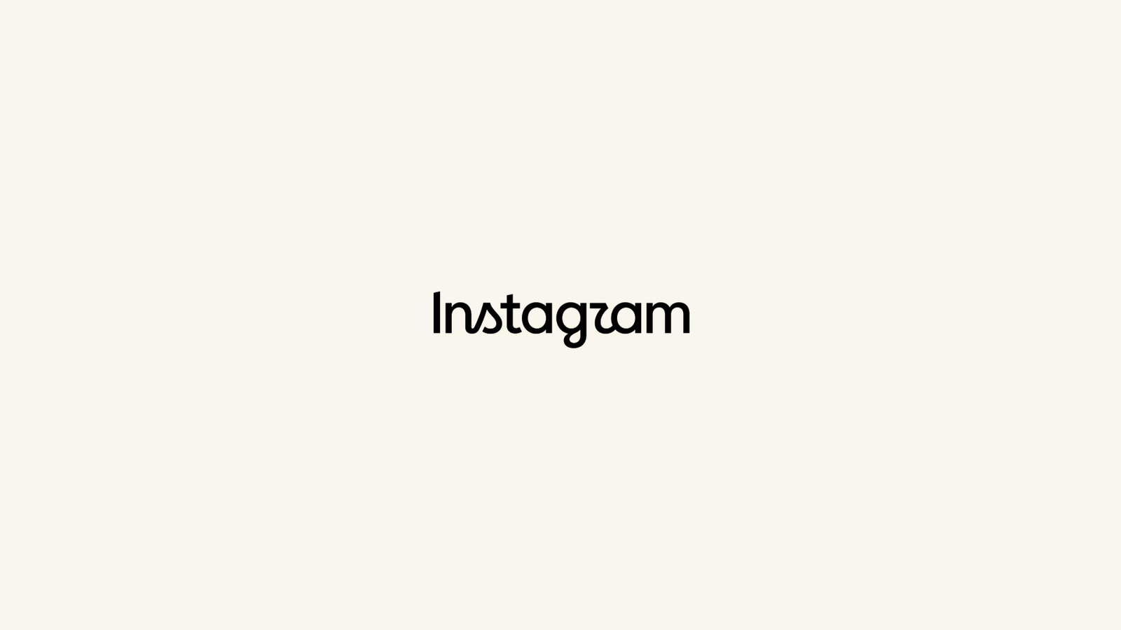
يبدو أن هذا هو شعار إنستغرام الجديد. على ما يبدو، كشف رئيس إنستغرام آدم موسيري عن الشعار الجديد يوم الخميس، وقدم شرحاً موجزاً حول الوقت المناسب لإجراء "تحديث أنظف وأكثر حداثة" للعلامة التجارية. يبدو أن هذا ليس مزحة. ومع ذلك، بعد النظر إلى الحروف الجديدة لمدة دقيقة كاملة، زاد الاشمئزاز والارتباك مع كل ثانية، استنتجنا أنه قد يكون فخاً للشركات. لذا، دعونا نلتزم بذلك بفرح وشراسة.

انظر بعمق إلى شعار إنستغرام الجديد. ادرس منحنياته، وتعرف على كيفية انتهائها بشكل حاد وعشوائي. تتبع خطوطه، ولاحظ أن بعضها متصل والبعض الآخر غير متصل - مما يجعل "ت" و "أ" المتتاليتين تبرزان بشكل خاص، وكأنها تقول شكراً بلهجة بريطانية لطيفة، أو ربما تشير إلى أن هذا هو المكان المناسب لبعض المحتوى السري T&A. قدر مزيجها المثير للاشمئزاز بشكل فريد من حروف نصف اليدوية والطباعة بدون مسافات. فكر ما إذا كان سيبدو أفضل إذا تدفق أسفل "ج" فعلياً إلى شيء ما. حاول إعطاء معنى لذلك "ر" المزعج شبه المتصل.

الآن، انظر فقط إلى الشعار. يقول "إنستازام"، أليس كذلك؟

هذه هي أفكارنا الأولية حول شعار إنستغرام الجديد، ولكن يرجى مشاركة مشاعركم الخاصة أدناه. ما هو أكبر خطأ في تصميمه؟ أو ربما أنت تحبه - في هذه الحالة، يرجى شرح نفسك.

Instagramlogodesign
الخبر متوفّر باللغات التالية:English
المصدر الأصلي للخبر
إنجاجيت

Use this space to roast the new Instagram logo

August 13, 2026·Engadget
Use this space to roast the new Instagram logo

In the war between cursive and print, everyone loses.

By Jessica Conditt Aug. 13, 2026 1:06 pm EST Meta

Apparently, this is the new Instagram wordmark. Apropos of nothing, Instagram head Adam Mosseri revealed the new logo on Thursday, providing a brief explanation about how it's time for a "cleaner and more modern" refresh of the brand. It seems that this isn't a joke. However, after staring at the new lettering for a full minute, disgust and confusion mounting by the second, we've concluded that it might possibly be corporate ragebait. So, let's all gleefully and maliciously comply.

Look at the new Instagram logo deeply. Study its curves, and recognize how sharply and randomly they terminate. Trace its lines, and notice that some of them connect while others don't — making the consecutive "t" and "a" stand out in particular, as if to say thank you in a cute British accent, or maybe suggest that this is a space for some secret T&A. Appreciate its uniquely jarring blend of half-cursive letters and sans-serif print. Consider whether it would look better if the bottom of the "g" actually flowed into something. Attempt to make sense of that disturbing, semi-connected "r."

Now just glance at the logo. It says "Instagzam," doesn't it?

Those are our initial thoughts on the new Instagram wordmark, but please, share your own feelings below. What's its most egregious design sin? Or, maybe you like it — in which case, please explain yourself.

Instagramlogodesign
This article is also available in:العربية
Original source article
Engadget